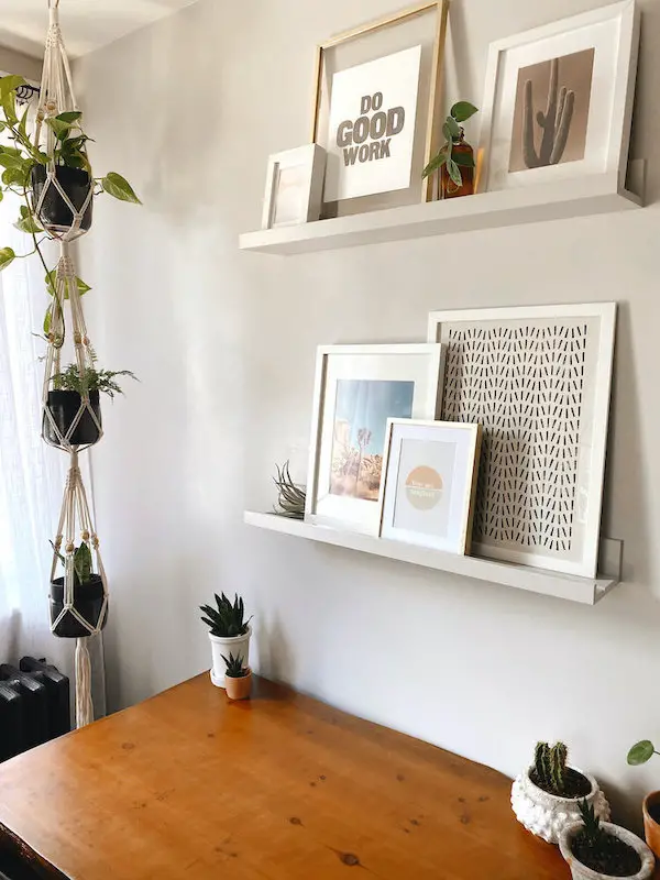
I’ve been wanting to add floating picture ledge shelves in our house for a while and my office is where I decided to take on the challenge. I spent a lot of time looking at different options and decided to go with good old Ikea and got the Maleras Picture Ledge. At first I was hoping to keep it the natural bamboo color, but once we hung them they clashed with my dark wood desk. Initially I thought about painting them white, but decided to try something a little different (different, or boring? The line is sometimes blurred in my neutral loving world). I painted them the same color as the walls to let the art do the talking.
You can see the full office makeover here
Tips & Tricks: How to Style Picture Ledge Shelves

One question I get from a lot of friends is how to style picture ledge shelves. Picking art and multiple frames styles that go together can be difficult. I get it, even I get a little overwhelmed with the process sometimes, and picture ledge’s have their own unique challenges. But in the end you can almost copy-paste what the pros do right in your own home. It’s just like a recipe – add one or this, two of that, one of those, and BAM you’re looking like a million bucks.
Here are a few of my top tips for decorating and styling a floating picture ledge shelf
Disclosure – This post contains affiliate links that, at no additional cost to you, I may earn a small commission from.
Groups of three
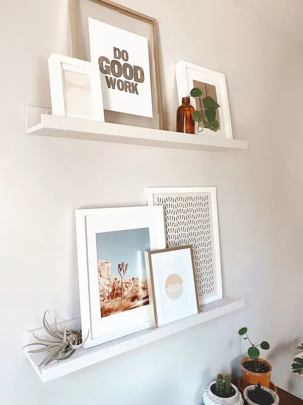
Remember that Schoolhouse Rock song “three is a magic number”? Keep that in mind with styling and you’ll be golden. I got three frames in various sizes for each ledge. I decided to stick with mostly white, but add in one gold frame on each shelf for a little something different (I purposefully chose the gold frames in two different sizes to keep them from feeling too matchy-matchy). If you’re styling a longer shelf and need more than three frames I generally recommend sticking to an odd number as a rule of thumb.
Picture Frame Sizes (left to right)
Top Shelf – 12×16 // 9×11
Bottom Shelf – 13×17 // 7×9 // 12×15
Vary your art strategically
I have an easy rule for picking out groups of art – One photo, one piece of fine or graphic art, and one piece more typeography/word focused. Keep them all in a similar color pallet and you’ll easily have group that looks varied but cohesive, which is what we’re going for here.
Pepper in fun elements to break it up
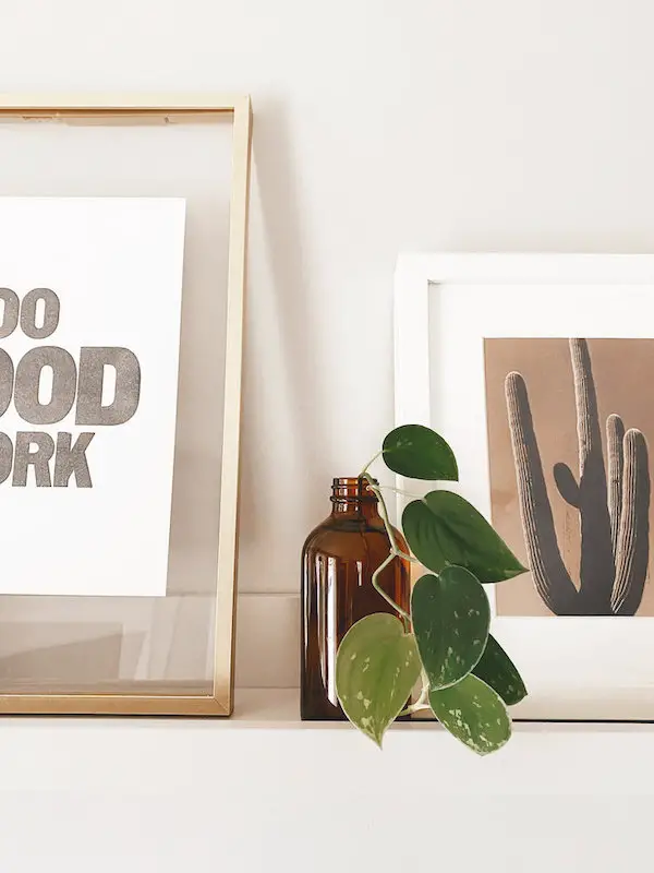
One of the best parts of styling a picture ledge shelf is that you can add in fun elements that you couldn’t with just a frame collage on a wall. A shelf with only frames can sometimes get a little boring, especially if you’re doing multiples. Even though my ledges were too thin to add any full plants I used an air plant and vine propagation to break things up and add some texture and greenery. You could also use other trinkets and fun finds instead, plants are just my easy go to!
Make it personal
In case you didn’t catch on, I tend to like things to be cohesive and stick to certain color themes. I often buy art that goes together, but I also love to add more personal elements to make it more “me”. The photo on the left of the bottom shelf when we were in Joshua Tree last year on vacation. Using that photo as a starting point and then picked the other art to fit with it. That keeps things cohesive, but still gives me all the warm fuzzies when I look up and the photo reminds me of our trip. If you have a photo you want to incorporate, but it doesn’t quite feel “right” you can try playing with filters to adjust the colors and fit with your color story.
One of the fun things about styling picture ledge shelves is that you can style it as a sort of collection. Different photos and items that all work together to tell a story or create a cohesive feel.
In the end, have fun. Get art and photos that make you happy!
My picks…
Top Shelf: Left, Middle, Right
Bottom Shelf: Left is my own photo, Middle, Right


COMMENTS