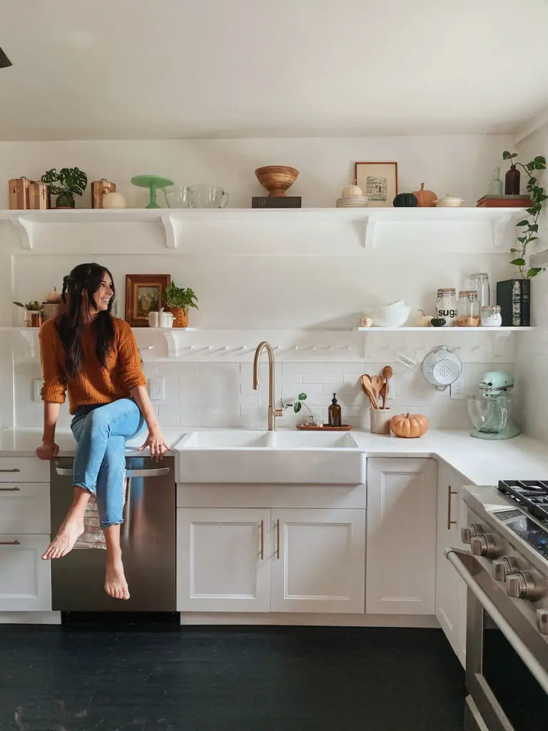
When we first bought our home the kitchen was tiny and oddly laid out. We quickly took down one of the walls to open it up a bit, but had to put any big renovation plans on hold while we worked on more important projects. Last year was finally the time we got to create the modern cottage kitchen of my dreams!
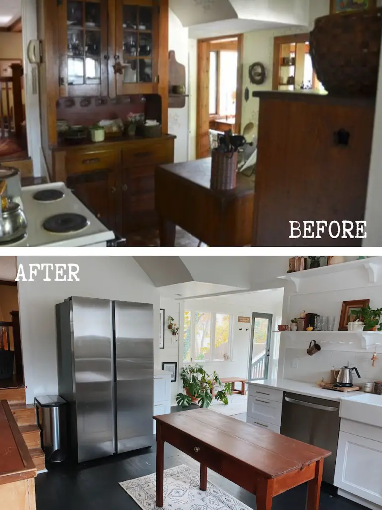
Can we skip to the good part? Let’s do it! Who doesn’t love a good before and after?
This post may contain affiliate links, which means I’ll receive a commission if you purchase through my link, at no extra cost to you. Please read full disclosure here.
Crazy, right? sometimes I look at old photos and can’t believe what I used to be (and how long we lived with it like that too!).
The Layout
Like I mentioned, the original layout was a big issue. There was an odd “pantry” type space between the dining room and kitchen. I’ve seen spaces like this in other old houses, but typically they have built-in cabinets. In our case it didn’t. It was the only space where a fridge fit, which meant if you opened the fridge no one could get from the kitchen to the dining room or vise versa. We removed the walls for that pantry space, which instantly improved it.
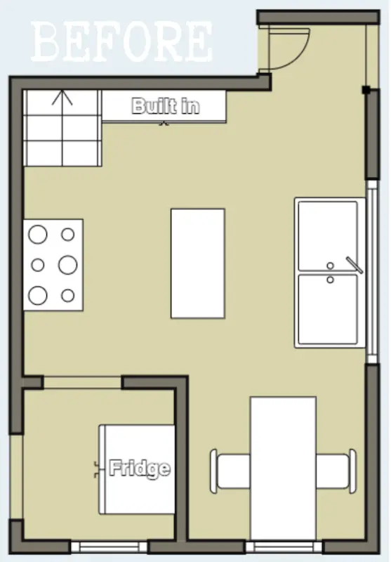
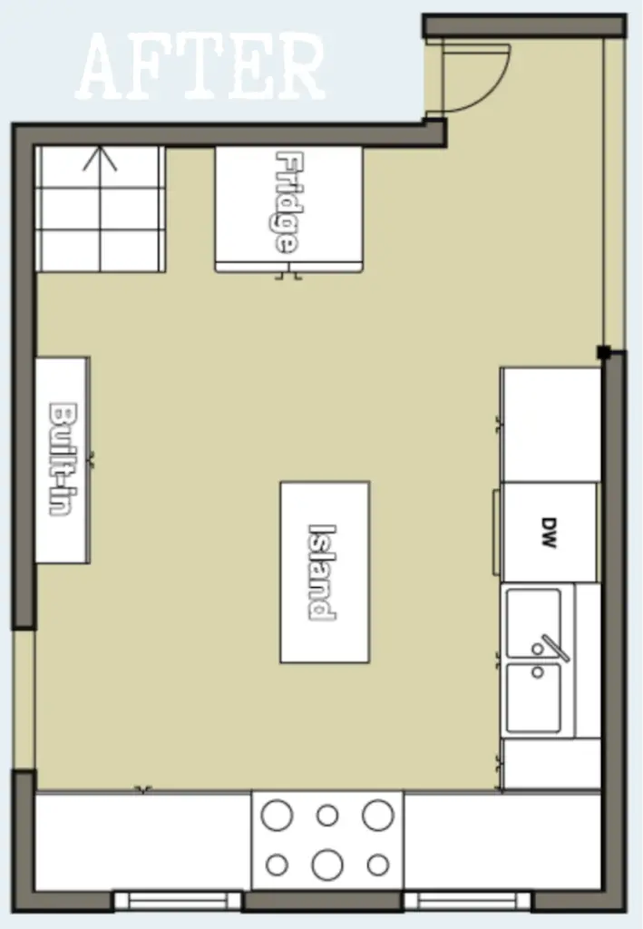
Another big issue was the doorway from the kitchen into the 70’s sunroom addition. It was super right and right up against the basement doorway. After a lot of debate we finally decided to widen the sunroom doorway and get rid of the look-through that was above the sink in the kitchen.
Figuring out where to put the fridge was difficult. Fridges are big and clunky, and I knew it would feel awkward and tight next to the dining room doorway. We eventually decided to (very carefully) move the original built-in cabinet to the shared dining room wall, so we could use it’s old spot for the fridge.
We also needed to shift the doorway between the kitchen and the dining room over a couple inches in order to fit cabinets next to the doorway. The kitchen was definitely one of those projects where it just feels like nothing quite worked out for us!
New Floors
When we first bought our house there was linoleum in the kitchen. We had our fingers crossed that there were wood floors hiding out under the linoleum we could refinish and we were kind of right. There were wood floors underneath, unfortunately they were in rough shape. Really rough shape. In fact, we were shocked to find the linoleum was hiding rot that could have easily give out with too much stress. Not good.
We always knew we were going to have to replace the cheap 70’s wood plank floors in the sunroom. Since we decided to widen the doorway between into the sunroom we felt it made the most sense to continue whatever flooring we did in the sunroom right through the kitchen.
Since we have real original wood floors in the rest of the house I wanted to avoid that real wood right up against faux wood floors (just personally hate that look!). We ended up going with these. For that (and a lot of other reasons) we ended up going with these Vinyl Plank Floors. Note: These floors look grey online, but almost pure black in person.
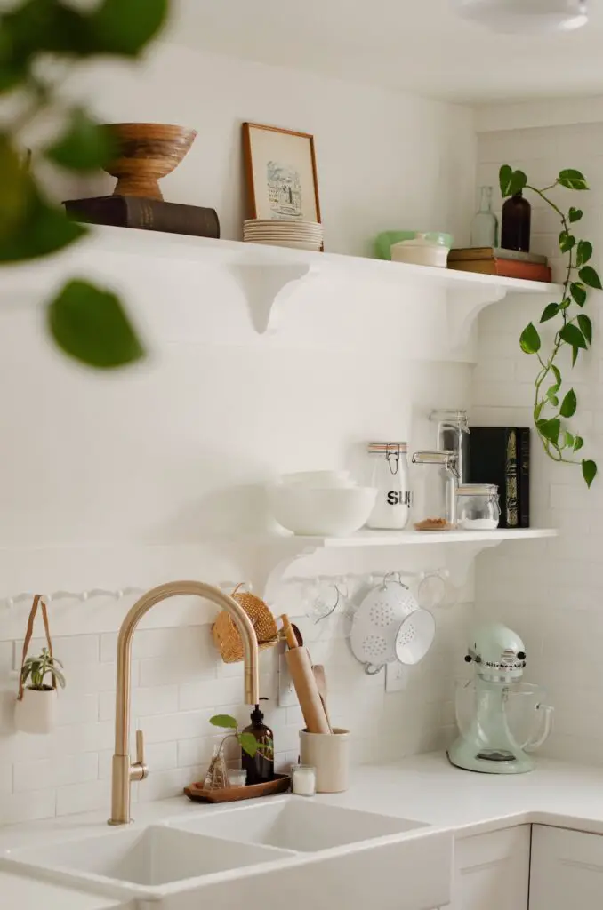
Cabinets, Countertops and Sink
As most people on a budget, we headed to Ikea to get our cabinets, and even ended up going with them for our apron sink and quartz countertops. The process was certainly not quick (thank you supply shortages of 2021) but overall was a good experience.
While I would loved to go with more of a beige (or even a muted green) cabinet, for the sake of the budget we stuck with an off-the-shelf Ikea option, so I went with classic white shaker-style cabinets. I know white kitchens have been more “trendy” the last few years, but I feel like it’s always a more classic look, and definitely worked with my modern cottage kitchen style I was shooting for.
For more info our our cabinets, counters and sink, you can check out full breakdown
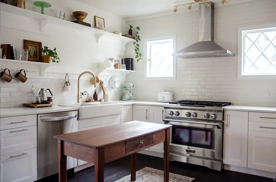
Tile
I was pretty picky about tile. By the end I had a big box of samples to my name. I wanted something that felt like it had a classic patina to it. Many people are familiar with the beautiful Clé tiles. I actually got some samples from them, even knowing they were a bit out of my price range. I ended up finding this “brick” style tile at Lowes that had a surprisingly similar handmade look to one of the clé tiles I sampled. I also went with a white grout to keep with the really clean and simple look.
This was my first time tiling. Thankfully, my dad came for a few hours to show me the ropes. From there I did the rest! The tiling and grouting took about a week to finish. I know it would have been a lot easier if I didn’t insist on doing a full wall of tile behind the stove, but I have no regrets! I absolutely love the wall of tile.
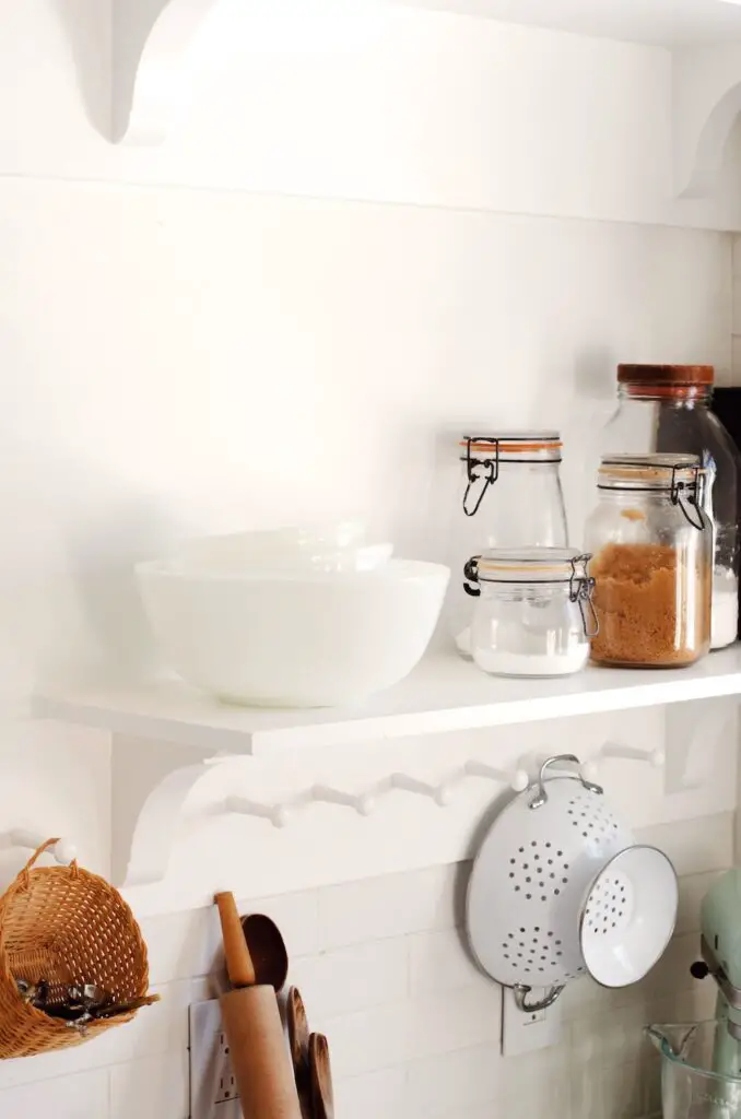
Open Shelves
With our kitchen layout we knew upper cabinets wouldn’t really work. Open shelving is a classic cottage kitchen look though, so I knew it would create an amazing focal wall. I ended up designing these custom shelves for us, which me and my husband build together.
Personally, I feel like the shelves brought in so much charm to the kitchen. The shaker pegs are a more traditional look, painted clean white I think it came together for a really lovely cottage inspired look!
See the full tutorial on how we built out custom kitchen shelves
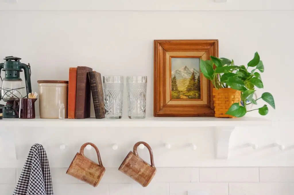
Modern Cottage Kitchen Decor
I knew with the all the clean white in our kitchen, it would be an opportunity for decor to really stand out – especially on those open shelves!
To balance the more clean modern vibes, I wanted the decor to add a lot of personality. To bring it all together I’ve focused on thrifted and vintage items, mixed with plenty of plants. Thrifting older items bring in a lot of history and personality that a brand new kitchen can feel like it’s lacking.
Check out my full guide to thrifting kitchen decor


[…] added three large open shelves during our kitchen renovation. We did two smaller shelves on either side of the sink, and one nice big long one across the full […]