Picking out Paint for the office makeover
Picking out paint colors is always a little bit of a struggle. My tendency is always just to go with white and call it a day, but then I’ll spend about six months over thinking it and going back and forth between other ideas and convincing myself I’m just boring and trying to find a color I can live with while still wishing I had just painted it white in the first place. It’s a process.
When I painted this room a deep blue years ago I had picked the color partly out of fear of being “that boring person” who paints their whole house neutrals. But then I spent years hating it. Not that I hate the color itself, it’s a lovely color blue, but I hate it in this room. It’s a fairly small room and the dark color made it feel even smaller. Just a few months of using it as an office on a regular basis was enough for me to gladly give up on caring about being that “boring neutral person.” I learned to embrace the popeye philosophy and accept that I yam what I yam.
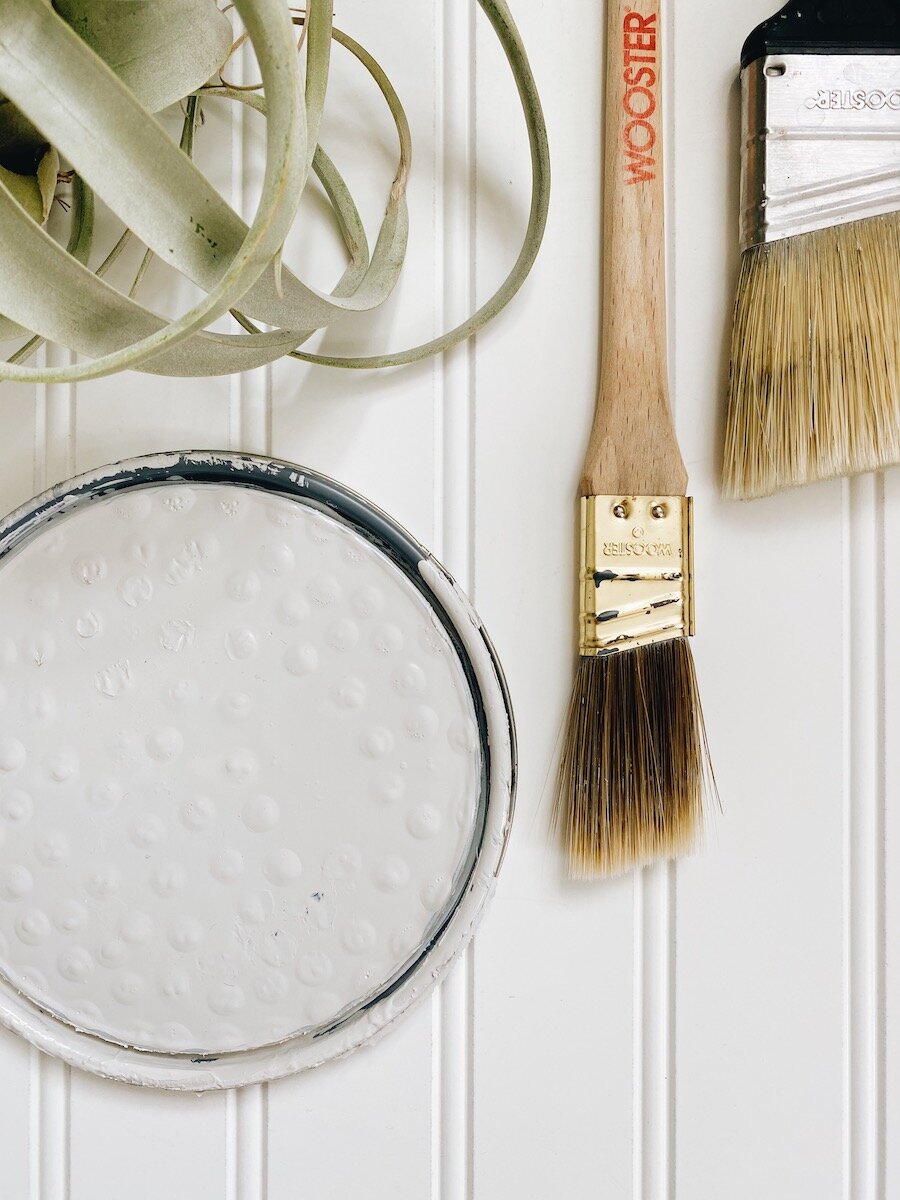
Whenever I am picking out paint I get a minimum of 3 samples. It’s so hard to really know what a color will look like until it’s on the wall, so I’d rather get a few extra samples to start with than run back and forth to Lowes (which wasn’t even an option these past few months anyway!).
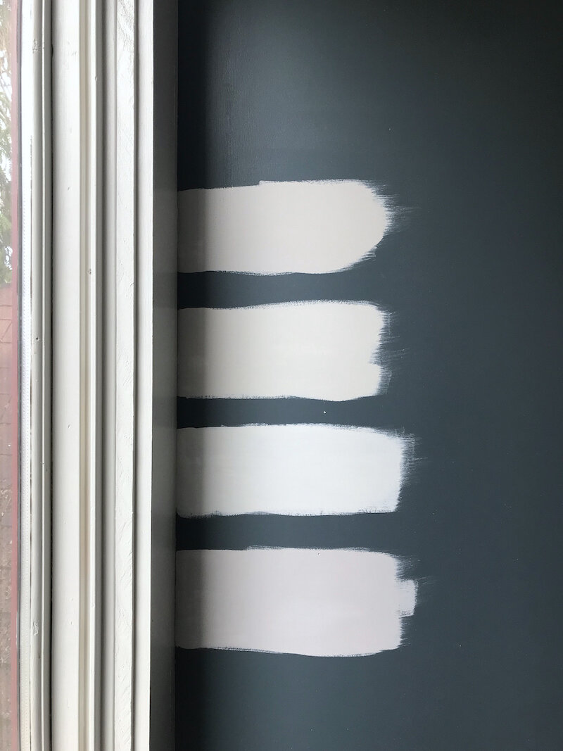
The above photo doesn’t do a great job of showing off my choices, but they were all various grey shades from Lowes I picked based off of some online suggestions. Here they are from top to bottom:
-
Filtered Shade (Valspar)
-
Tempered Gray (Valspar)
-
Summer Grey (Valspar)
-
Grayish (Sherwin Williams)
Honestly, they all looked good in person, but I decided to nix the bottom two off the bat. Summer Grey was nearly identical to the trim color, which I didn’t plan on changing and I had decided I didn’t want to do white/white. Grayish had a little more of a purple-y tinge to it than I liked, so that was an easy no. So it came down to Filtered Shade and Tempered Grey. I did additional big sample swatches with both of them in several different spots in the room to try to get a full sense of how they each caught different light.
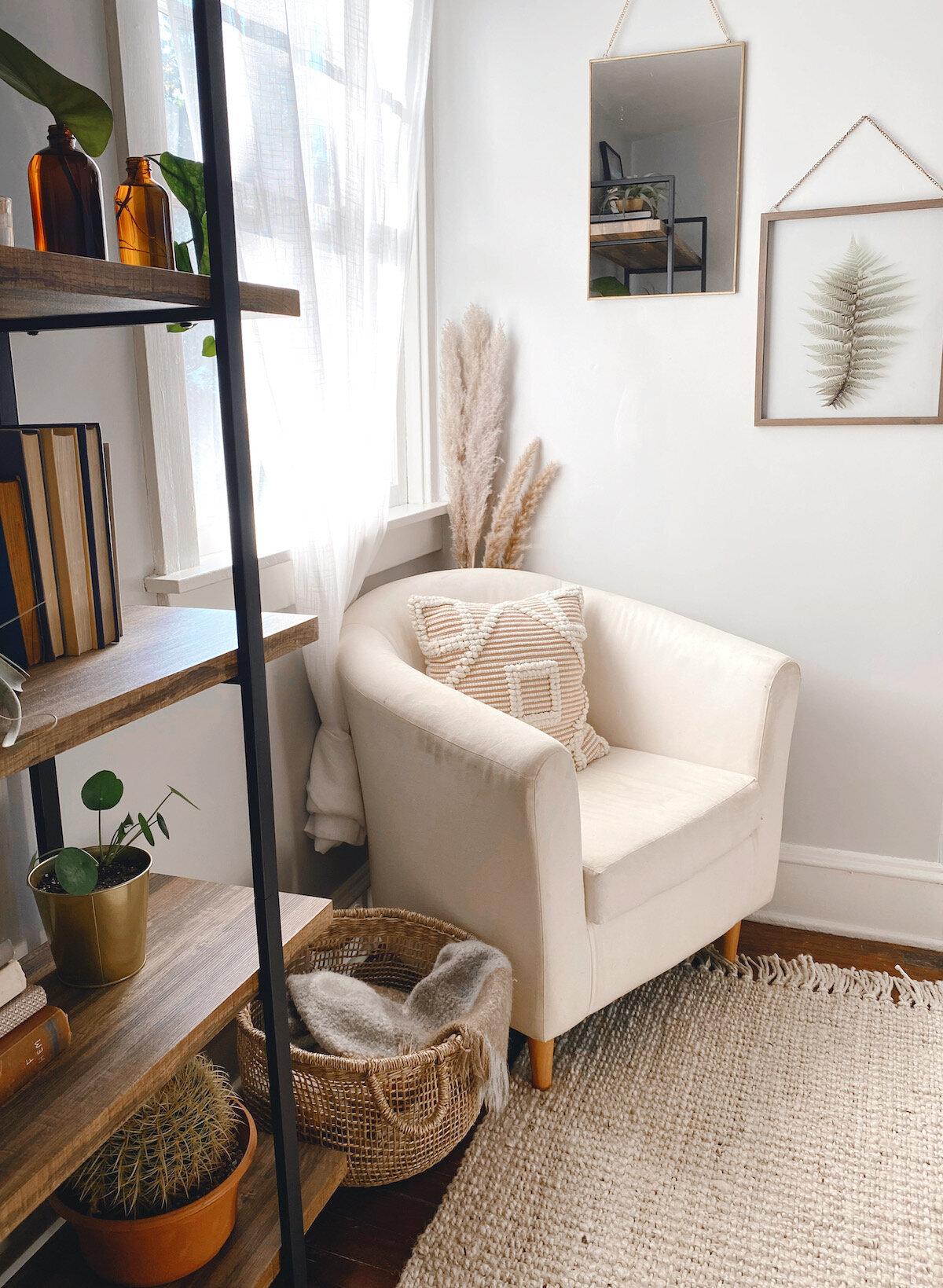
In the end I decided to go with (drumroll please…) Filtered Shade! It had a little more grey too it but was still really bright and airy.
This post is part of my One Room Challenge guest series. so you can check back next week for the reveal of how the paint turned out! I’ll be posting new updates and progress on the office each Thursday through June 28th.


I can’t wait to follow along on this space. ! See ya next week 👍
Thanks Jenna!
That’s going to be an amazing difference – looking forward to seeing the new lighter color
Thanks Lindsey! Really excited about it too!